

When companies set off to build their BI applications, the most common mistake they’ll fall into is foregoing user interviews. We often hear: “But we already know what we want. Here’s a list of metrics we need displayed in this dashboard. Can’t you just design the dashboard based off of this?”
But like any product (or at least, the successful ones), it doesn’t quite work like that. You can’t expect to make the perfect sandwich for a stranger (what if she doesn’t like mustard?!). You can’t expect to cure a patient you’ve never talked to. And you can’t throw just any chart on a dashboard and assume that it’ll solve your users’ business problems.
The heart of the issue is that a list of metrics simply doesn’t get to the who, where, when, why, and how of a problem. It’s an outline, but certainly not a roadmap. And this is exactly what user interviews venture to uncover.
We’ll give you five reasons why user interviews are critical.
1. Align business goals with strategy.
When interviewing the people who’ll use the application, you may uncover disparities between groups of users regarding goals, problems, and expectations. By beginning to understand how wide the gaps are, or what one group could learn from another, you’ll start creating a common language that’ll help drive the company toward alignment between company goals, user goals, and application goals.
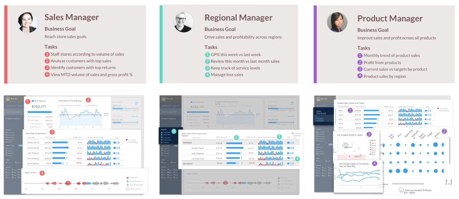
2. Understand how each user group would use the dashboard.
Even after you understand the high-level “why” from a company, user, and application perspective, you may still lack the answer to the “how” question. User interviews will help parse out how different groups of people might approach the same set of data in completely different ways.
Let’s take a manager and an analyst, for example. The manager is extremely busy and wants to be able to glance at the dashboard for a couple of minutes and immediately come to a conclusion of whether or not the company is on track. If something looks off, the manager might call an analyst.
The analyst would then need to dig deeper to find answers. Why is this number off? What happened, and when? Has this been happening for a while? The potential list of questions goes on and on — but we know for certain that this analyst will want a dashboard designed for more detailed analyses.
If we had designed an in-depth, exploratory dashboard for a manager, then we would’ve gotten a frustrated and inefficient user. And if we had put an explanatory, high-level dashboard in front of the analyst, then that dashboard would’ve been useless and inept at answering questions.
Both dashboards may have the same list of metrics, but they need to be designed differently for different users and purposes.
3. Clarify the “why” of each metric.
One of the most important things we learn from user interviews is the “why” behind each metric, and the key questions that each user is trying to answer from the data. What business problems are they trying solve? What types of insights do they need to get from the dashboard? For example, let’s say Gross Margin is on that list of metrics that needs to be on the dashboard. But why is this metric important? Sales managers might look at this metric just to see how their salespeople are performing, while a CFO might be monitoring this metric to see if it’s changing based off of a recent change in strategy.
4. Pick the right visualizations to answer the right questions.
A single metric could have an entire menu of visualization methods. For example, “revenue” could be displayed as a single KPI number, as a line chart showing revenue over time, as a bar chart that displays revenue versus target, or as part of a larger table of metrics.
But by first understanding the reasoning behind the metrics and the question that the user is trying to answer, we’re able to create more effective and targeted visuals for the metric to live in. If the question is: “Is my revenue increasing over time?” then a line chart would make sense. If the question is “How much has my revenue increased from the previous year?” then maybe all we’d need is a number with the dollar or percent change from the previous year.
5. Direct the flow of the dashboard to be actionable.
And finally, user interviews beg the “so what” question — an essential step in making dashboards actionable, rather than just informative or pretty. Follow-up questions like “What would you do next if your revenue has dropped?” will give us an idea of how the charts and screens should be arranged to logically match a user’s flow of questions. That’s when data becomes powerful.
To conclude…
User interviews are game changers! Sometimes, the metrics that users want might not be the right ones to solve their problems. Or, you may uncover completely different use cases and analyses that no one had thought about before. We’ve often run into that in the consulting world, where one company might use the same 5 metrics as another company, but because of totally different business contexts, they’ll require two separate designs. Requirements gathering simply doesn’t give you the full picture or guarantee an impactful high-quality solution —
So, whenever possible, conduct user interviews.
The Contributors:

Liza George has a Master’s degree in Human-Computer Interaction from Georgia Tech with a background in architecture. She enjoys all forms of design, from buildings to screens. Liza likes reading, kickboxing and playing video games in her free time.
 Jessie Lian is a UX designer at Axis Group, she has a background in information management and business. She has a passion for understanding people, a fascination with info viz, and an obsession with color palettes. You can often find her celebrating & contemplating in the great outdoors.