

Knowledge is power and knowing how your business is performing and how it compares in the external marketplace can provide the power of competitive advantage. Sponsorship is a growing source of revenue, and it can also provide insight on performance within a given market or industry. Measuring performance and growth can be quite difficult without the correct tools. Possibly more difficult, is the ability to compare growth within an industry or market. An individual business can track their growth from the sponsorship they receive based on their performance. The same business may also require the ability to compare their performance against the overall market, including their competitors in the same industry. It may be difficult for an individual business to access specific details about competitor’s sponsorships, however it can be helpful to see how the overall market is performing or an overall measure of how the competitors in the same industry are performing. This dashboard was created by Axis Group, utilizing visualizations that help promote healthy growth management through comparison, which can provide an advantage over competition.
How Axis Group Helped
The dashboard includes multiple pages using various charts and KPIs in a consistent manner. While the metrics may change on different pages, each uses a similar layout and consistent color scheme. Red is utilized to highlight where a category is underperforming, while blue is utilized to highlight where a category is performing positively. The majority of graphs include, bar charts, line graphs, bullet graphs, and stacked bar graphs, which were chosen to offer comparisons to market and industry metrics in the given category.
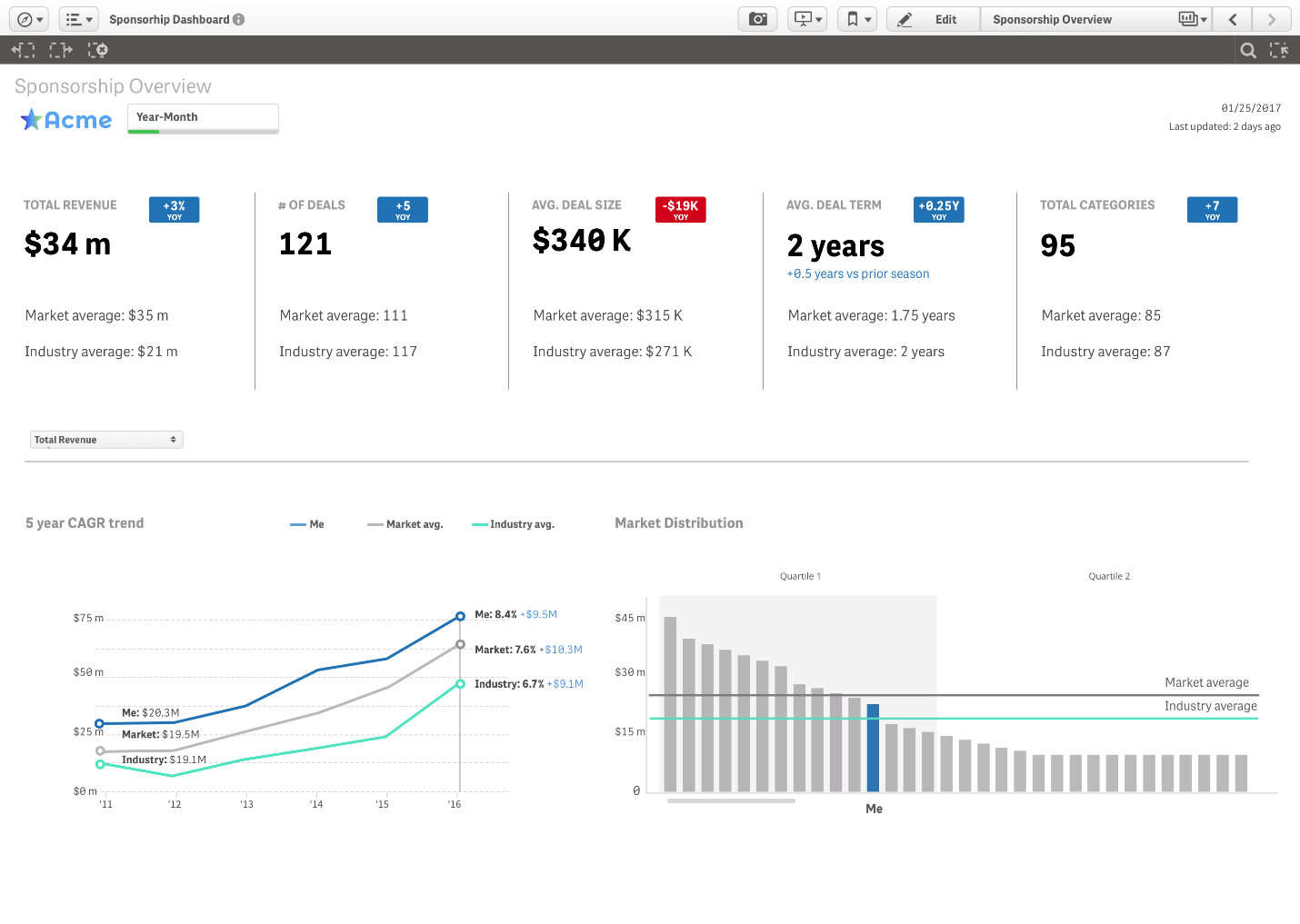
The dashboard above has been constructed with high-level KPI’s towards the top of the page. Each KPI illustrates a different metric, however each one also provides an internal comparison of the metric based on last years performance and external comparisons utilizing market rank, market average, and industry average. The CAGR Trend line graphs depicts the annual growth over a 5-year period, also offering peer and market comparisons. Distribution is depicted utilizing a bar graph which highlights the trend throughout the different quarters and continues to provide the market and industry averages. The current measure being shown in both graphs is Total Revenue, as shown in the drop-down selection box, however this can be changed to other measures such as Total Sponsorship Revenue, # of Deals, etc.
Summarized Points:
- It may be easier to compare individual growth and success to the overall market or industry because specific data on direct competition may be unavailable
- The dashboard utilizes various charts that offer the ability to visually compare market, industry, and individual growth
- A consistent color scheme depicts positive and negative growth in a given area throughout the dashboard
The Contributors:

Manasvi has a Master’s degree in Human-Computer Interaction from Georgia Tech with a background in Interactive Computing. Manasvi's design philosophy is rooted in research and rapid prototyping. “Fail early and fail often” is her motto. Manasvi enjoys discovering and sharing new articles and podcasts on design, as well cute animal GIFs for when you need a pick-me-up.

Matthew Howarth graduated from Pennsylvania State University with a degree in Information Sciences and Technology and a minor in Business. He is an Associate Solutions Consultant at Axis Group. In his free time he enjoys fitness activities, such as Crossfit and running.