

Did you know that you can add your own custom columns to Field Parameter to create custom, interactive visuals and report pages? For example, you can design a report so users can select a time period in a button object and update all applicable visuals on a report page to analyze by the selected time period.
The Power of Custom Field Parameters
In the world of Power BI, flexibility and customization are key to creating effective data models and visualizations. Field Parameters enable custom visual states and interactive functionality, while simultaneously making it easier to maintain and repeat your work.
Before the introduction of Field Parameters, Power BI developers had to rely on bookmarks and "parlor tricks" to enable various visual interaction functionality, such as duplicating visuals, layering them, and then toggling their visual states based on a user selection in a button visual. While bookmarks provide a certain level of customization and are still useful in limited scenarios, they are generally cumbersome, hard to maintain, and easy to overwrite. In contrast, Field Parameters are a much more flexible and maintainable solution for custom visual states and interactive functionality. Field Parameters are easy to set up and use, and enable a much wider range of customization options than bookmarks ever did.
Field parameter tables can be connected to each other or to other tables in the data model to enable user-driven, dynamic visuals. In this advanced technique, you create custom index or key columns in Field Parameter tables to be able to connect them like building blocks. In turn, this "mini-model" allows user choices to propagate throughout your data model or the Field Parameter mini-model to drive a visual action.
This approach is extremely versatile and can be applied to a wide range of use cases, enabling report designers to easily create and deploy highly customized, interactive report experiences for users. By creating a whole data model of field parameter tables, you can drive dynamic choices and logic that were previously difficult to achieve.
An example
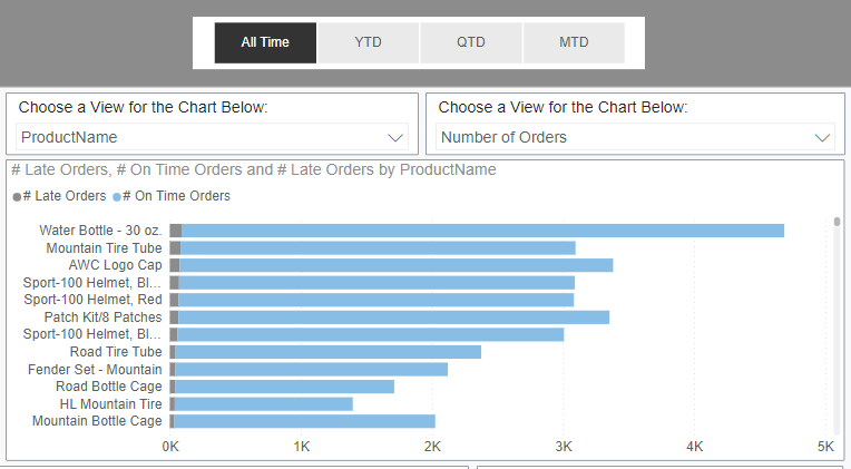
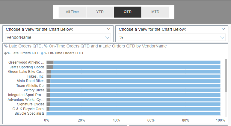
Consider the following group of visuals on an example report page. The values displayed in the bar chart depend on the choice selected in the three toggles: Time Period, Y-Axis, and X-Axis. Notice the different choices selected in the toggles in each image, and how the bar charts differ.
How it works
This dynamic functionality is powered by a small network of field parameters and, occasionally, manually-created flat tables. These "flat" tables are connected to Field Parameter tables via index columns. Meaningful columns, like text columns, in the flat tables can be leveraged in slicers as the list of user choices. Since the tables are linked in the data model, the user choice can drive an action in one or more visuals. (Flat tables are useful for custom and complex scenarios; however, they are not always needed.) Field Parameter fields can also be used by themselves in slicers to drive dynamic visual changes.
Common situations in which a Field Parameter network (Field Parameter connected to a flat table) is needed is where one user selection changes or adds multiple fields to a visual at one time; for example, the x-axis in the previous example. The x-axis has two fields: Late Orders and On-Time orders. A user chooses to view these two metrics as either a whole number or as a percentage. Users can only select one format at a time, and both metrics (late & on-time) are updated simultaneously. One user selection updates two fields in the visual, thus a field parameter network is needed.
In the example images (above), let's understand how the two dropdown slicers entitled, "Choose a View for the Chart Below:", drive functionality in the bar chart. The Time Period button bar at the very top also impacts the bar chart, but it can be ignored for now. Its complexity is explained in another section of this article.
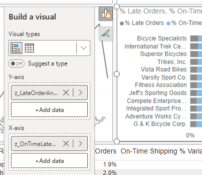
The left slicer controls the field displayed in the bar chart's y-axis and the right slicer controls the x-axis. The left and right slicers are configured to 'filter' the bar chart.
Y-Axis Slicer & Field Parameter:
Here are the additional choices a user can select in the left slicer:
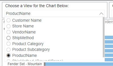
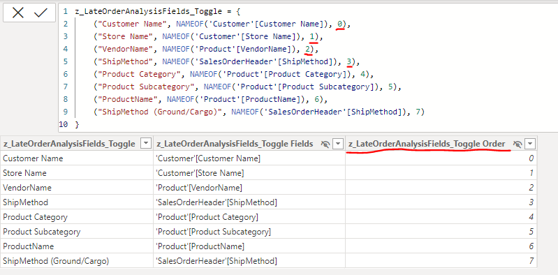
The field used to create this slicer comes from the Field Parameter table, z_LateOrderAnalysisFields_Toggle, which is composed of various measures. The actual column used in the slicer is the first one, z_LateOrderAnalysisFields_Toggle; This column contains the text choices available to users in the left slicer.
Notice the farthest column on the right, underlined in red, z_LateOrderAnalysisFields_ToggleOrder. This is an index column that is created automatically with the Field Parameter, and the values correspond to the order in which the fields were added to the Field Parameter. Additionally, this is the column that determines the sort order of the table. Meaning, the order in which the fields will appear in visualizations (see image of slicer choices, above).
The same text field used in the left slicer, z_LateOrderAnalysisFields_Toggle, is used as the y-axis field in the bar chart. This way, when a user makes a selection in the left slicer, that choice is reflected in the bar chart because the two visualizations are linked by the same Field Parameter column. This y-axis slicer is actually a simple field parameter case, as it only has one index/key field (the auto-generated, numbered column) and the table stands alone in the data model (unconnected to any other table in the data model). The right, x-axis slicer will demonstrate a more complex scenario.
X-Axis Slicer & Field Parameter:
Here are the additional choices a user can select in the right slicer:
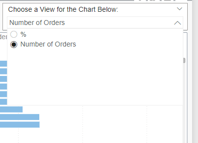
The choices in this slicer actually come from a column in a flat table, zSlicer - Num or Percent. The 'Type' column from this table is used in the right slicer.
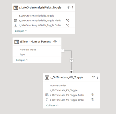
The flat table, zSlicer - Num or Percent, was manually entered in Power Query and it is connected to a field parameter table that is different than the one for the Y-axis. zSlicer - Num or Percent, is connected to the field parameter table, z_OnTimeLate_#%_Toggle through the key field, NumPerc Index.
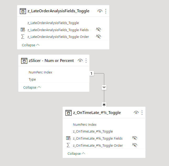
Here are the measures that make up the x-axis field parameter table. In addition to the auto-generated index column, z_OnTimeLate_#%_Toggle_Order (third column from left), notice the very last column underlined in red called NumPerc Index. This is an additional, secondary index column, which was manually added to the Field Parameter table. Instructions on this process will be provided further below, but this field parameter is part of a more complex case.
The first index column, z_OnTimeLate_#%_Toggle Order, will always be used to determine the sort order of the fields, but the second index column, NumPerc Index, is connected to a flat table. This is where the magic happens.
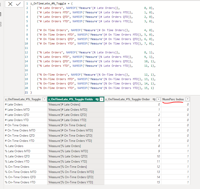
Connecting the flat table to the field parameter table allows selections in the flat table to flow to the field parameter table. In this example, the text column in the flat table gives users two choices: View orders as a whole number or as a percentage.
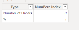
When they choose one option, that is reflected in only the fields in the Field Parameter table with a matching NumPerc Index value to be displayed. 0 corresponds to the whole number representation and 1 aligns with percentage. The bar chart's x-axis features two measures: one for late orders and another for on-time orders. The network the flat table and the field parameter table create, allow for multiple fields to be connected or grouped to one possible user choice. Behind the scenes, two measures are updated; whereas, users only need to make one choice.
How to Add Columns to Field Parameters
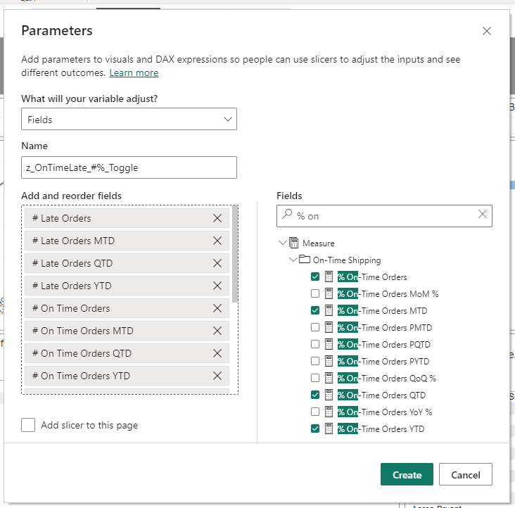
Create a Field Parameter by adding fields or measures from the model. The fields will be listed in the field parameter table in the order in which they are added in this step.
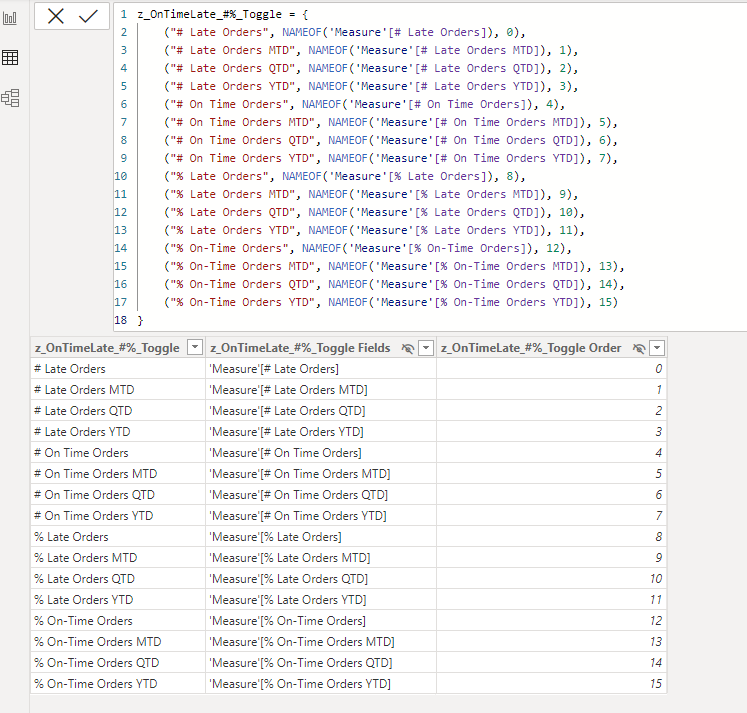
Once created, a Field Parameter table is added to the data model. This is the table viewed in the Data View. Notice the third column, which is the auto-generated index column.
To add an additional index, key, or linking column to this table, simply click in the Code Editor (top window) and type in the values for the new column for each row. Column values should be separated by commas. New columns can be created with number or text values. When values have been added for each row in the table, select ENTER to update the Field Parameter code. A new column will be added with a default title, Default + Column Number (boxed in red in the image below).
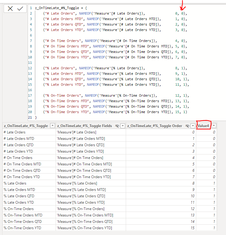
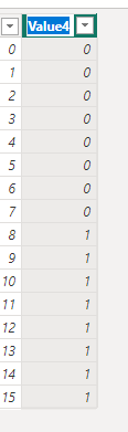
To rename this new column, double click on the column header. Type in a new name and press enter. The example column is renamed from 'Value4' to ' NumbPerc Index' in the images below.
That's all that it takes to add a new column to a field parameter table. Now this column can be used to created relationships with other tables. There is no limit to the number of additional columns you can add to a field parameter table, but consider good data modeling practices when employing this technique.
More Complexity
Now, let's circle back to the Time Period button selector mentioned earlier.
The left and right slicer examples were pared down to demonstrate two cases:
- a simple, stand-alone field parameter table (y-axis)
- a more complex case with a flat-table linked to a field parameter table to make multiple selections at once. (x-axis)
These two approaches can be used in combination with each other to create complex visuals, or field parameters, flat tables, and even data tables are all linked to drive visuals based on logic. The Time Period button is part of a complex Field Parameter model that dynamically changes between a group of time-based measures so that users can analyze different time periods dynamically in visuals.
The image below depicts part of a complex model of Field Parameter/flat tables. This "mini" model developed iteratively over time, with one table or visual use cases added at a time. There is some complexity in maintaining or adding new tables to make sure everything interacts in the intended manner, but it offers the benefit of reusability. Here, we can make sure users can dynamically pick between the Time Period analyzed for multiple report pages without having to repeatedly reconfigure complex logic. This approach requires some time initially to set up, but it provides long-term time-saving benefits.
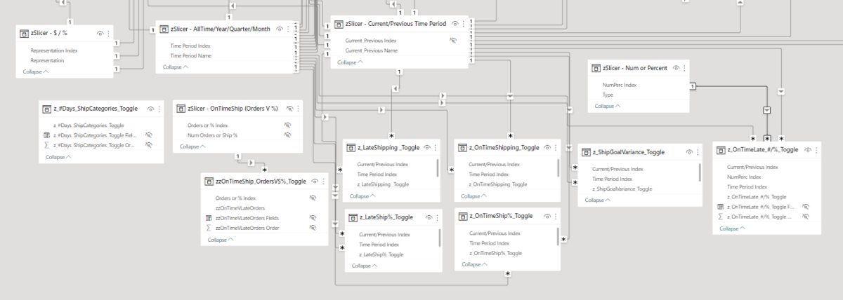
Bookmarks can also be used to drive dynamic visuals; however, these are harder to maintain and very easy to overwrite. Unintentionally overwriting a bookmark can cause developers to lose work and changes cannot be recovered or tracked. The field parameter approach overcomes these issues and is much more efficient for the model. Dynamic visuals using bookmarks typically rely on multiple copies of the same visual overlaid on each other on the report canvas, and the bookmark changes which visual is "visible" or "hidden" as any one time. This makes users think a single visual is updating with their interactions, but really is just switching between layers of visuals. The Field Parameter approach requires less computation and storage, even when used in a complex model like shown below.
Be Creative
This technique is an extremely versatile and helpful skill you can learn in Power BI, as it's the secret sauce to custom/flexible visuals and easily enabling a unique user experience. This approach offers many benefits over the traditional use of bookmarks, including scalability, reusability, and saving time. It's also a flexible approach that can be modified to meet a wide variety of simple and complex use cases. Overall, be creative, as the sky is the limit when you use Field Parameters and custom index columns to power interactive visuals!