

In a world where bar charts and pie charts run rampant, it’s quite a thrilling thing to create a new and unusual way to visualize data. (It makes me feel a bit like an explorer who’s discovered new lands or a chemist who’s found a new element… that may be a slight exaggeration but it really does feel good). Because, as Amanda Cox wisely noted, “There’s a strand of the data viz world that argues that everything could be a bar chart. That’s possibly true but also possibly a world without joy.”
So, in the name of joy, this post will walk through three new data visualizations that we at Axis Group created, specifically by building upon and remixing existing charts so as to further expand the grounds on which data visualization can stand on.
The Icicle Plot
The Icicle Plot is an extension, literally, of a Parallel Set chart, which takes buckets of data and breaks them down into other categories by using the width of the lines and flow-paths to represent the proportional fraction of the category total.
Below, we took greenhouse gas emissions data from medium- to large-sized buildings in Boston (souce: BERDO) and illustrated how buildings that have reduced emissions by 0–5%, 5–10%, and 10–15% break down into primary power sources, then into year built, and finally into property type. The flow is sequential and additive, so that if you’re looking at the last level of property types, you’re able to, for example, trace which property types reduced emissions by 10–15% and had a primary power source of electricity and were built in the 2000s. The main question we wanted to answer with this visualization was: What are the potential factors that might contribute to a building that has been able to reduce, as well as not reduce, GHG emissions?
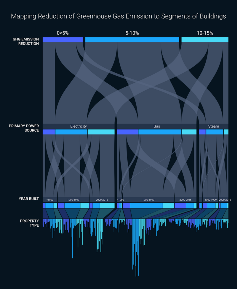
But with a standard Parallel Set chart, there’s a limitation in how many categories can be included at each level, since an overcrowded chart can very quickly become unreadable, with the widths of flow-paths indistinguishable.
The Icicle Plot solves this problem by rendering the last level into a bar chart, and encoding the count of buildings (that have the attribute of, in our example, some property type + year built+ primary energy source + GHG emissions reduction %) with the length of bars rather than the width of a flow-path. With a hover capability, a user would be able to look at the visualization and immediately see from the longest bars which property types contributed most to GHG emissions reductions.
The Heatswarm Plot
The Heatswarm Plot is a mashup between a beeswarm plot and a heatmap, where color is used to encode a beeswarm plot (which, similar to a strip plot, shows the distribution of individual data points for a given measure, but is packed into the shape of a violin).
In our example below, we used the GHG emissions data again, and wanted to see if there were patterns as while as anomalies within specific dimensions (property category is shown in the example). The beeswarm plot would allow you to easily see if any buildings fell outside of the normal distribution, which could help identify candidates for deep energy retrofits.
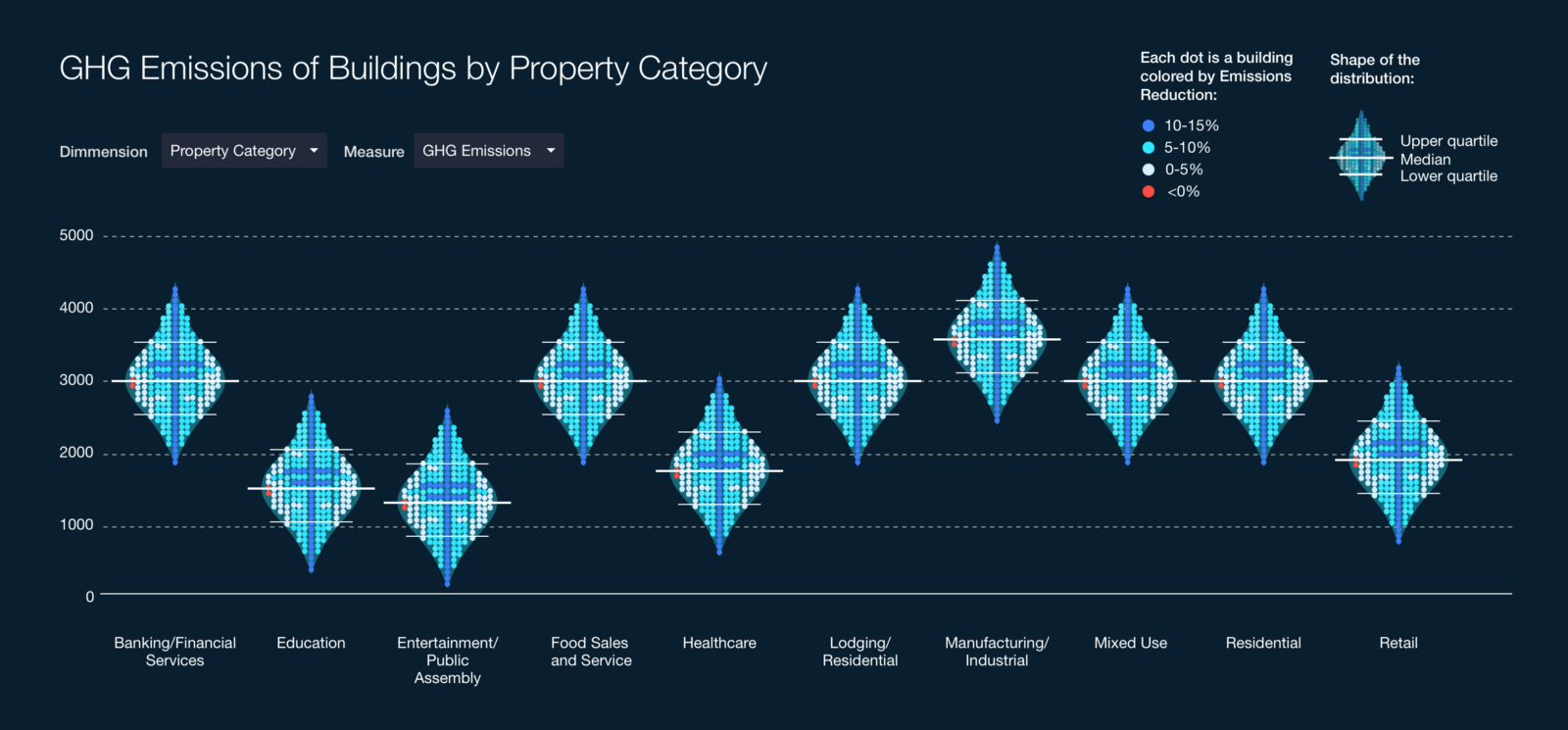
But a natural question that might follow is: What does the GHG emissions reductions effort look like for these buildings? The heatmap element is able to address this question by coloring each dot by emissions reduction percentages, adding a useful layer of insight to the chart.
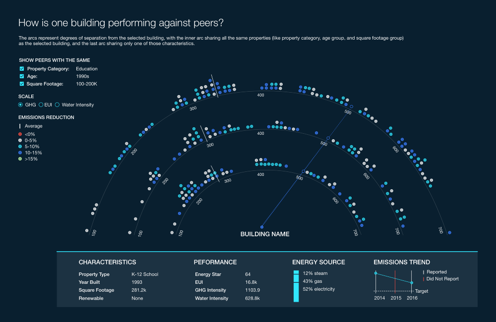
The Saturn Plot
The Saturn Plot uses arched strip plots to first group peers, and then to visualize how a single data point compares against those peer groups. The data point of interest sits in the center of the arcs, and a dotted line extends from the dot to where it would be placed on the surrounding strip plots. The inner arc plots points that share all the same properties as the data point of interest (i.e. property category, age group, and square footage group), the second arc plots points that share 2 of the same properties, and the outer arc plots points that share only one of those characteristics.
This provides an easy way to see how one data point ranks compared to different definitions of “peers.” Using our same dataset again, building owners would be able to select their own building, see how they’re performing compared to peers, and identify buildings they might want to reach out to and learn from.
Where can I find working versions of these charts?
While our team hasn’t built out these charts exactly to spec yet, we do have alternatives that are live (we had to iterate designs based on feasibility & time restraints), and still serve the purpose they needed to. We replaced the Icicle Plot with a Sunburst, which still allows a user to see what characteristics make up buildings that have reduced emissions by 5, 10, 15%. The Heatswarm Plot is closest to spec, and while it lacks the color ordering, it is still successful in allowing the user to draw patterns and identify anomalies. And the Saturn Plot was replaced with 7 small strip plots, each one representing a different grouping of peers.
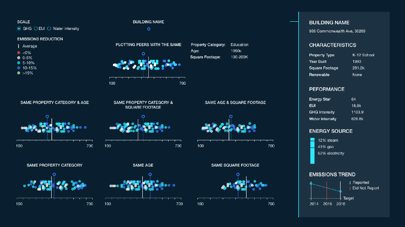
This was an iteration that many of us actually liked more than the original Saturn plot, because 1) straight lines are always easier to read than curved lines, so it’s functionally more practical, and 2) it actually identifies and labels the 2 or 3 characteristics that define the peers being plotted. We’ve lovingly named this version “the UFO plot.”
In conclusion…
If you’ve got a solid grip of the questions you’re trying to answer with data, there’s a good chance you’ll be able to discover a new visualization too, since you’ll be designing the chart around the users’ needs rather than fitting the needs into a pre-existing chart. While this may complicate development and implementation, we’ve found that most of our creations (so far) are adaptations or combinations of existing charts, which certainly helps!
But the key is to start the process without those development restraints. Envision all the possibilities of depicting the data, understand the core purpose of a chart, and trim down and adjust at the end to fit into what’s feasible, while still maintaining the core of a visualization.
The Contributor:

Jessie Lian is a UX designer at Axis Group, she has a background in information management and business. She has a passion for understanding people, a fascination with info viz, and an obsession with color palettes. You can often find her celebrating & contemplating in the great outdoors.