

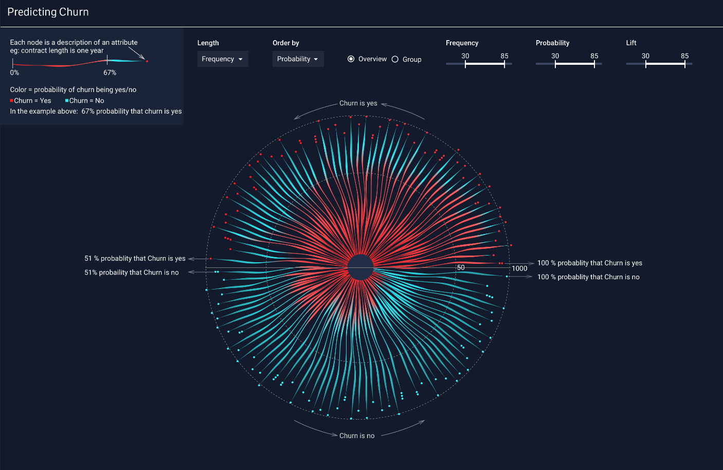
Capturing the attention of your audience can be difficult and keeping it can be even harder. Grasp the attention of your audience using stunning visualizations like the Iris Chart featured above while still providing insight. The purpose of this chart is to predict customer churn.
Migrating from Qlik or Tableau to Power BI / Fabric?
Don’t start from scratch. Vortex automates up to 70% of the work—cutting costs, time, and risk.
See how Vortex can simplify your migration →
How Axis Group Helped
The challenge was to create a graphic that conveys information clearly and provides insights without being another bar chart or a series of boxes individually labeling attributes and churn rates. Each dot on the Iris represents a customer group while the length of the line indicates the relative quantity of customers in that group. The color choices are aesthetically appealing but still naturally convey positive and negative aspects of the data. The colored lengths of each line display the likelihood of churning. This allows the audience to quickly discern which groups are higher risk and which customers to market more heavily to. It does this while also providing the context of this churning. This chart can catch the attention of a new user while providing enough insight to keep an analyst coming back for more.
Summarized Points:
- Captivating your audience can be an important part of educating them
- Colors can be complementary and still communicate data effectively
- Insight and attractive visuals can coexist
The Contributors:

Liza George has a Master’s degree in Human-Computer Interaction from Georgia Tech with a background in architecture. She enjoys all forms of design, from buildings to screens. Liza likes reading, kickboxing and playing video games in her free time.
 Patrick Bull has a B.S in Mechanical Engineering with a minor in Computer Science from the University of South Carolina. He enjoys problem solving with technology. When he isn’t working he enjoys basketball, water sports, and video games.