

Power BI is an excellent tool for data analysis and visualization, allowing users to create interactive reports and dashboards, but sometimes you want present your data in a way that doesn't easily conform to the standard UI options that Power BI offers.
One great way to display data concisely is a Scorecard.
But creating a scorecard in Power BI can be tricky. Here's a simple, reliable, and maintenance-friendly method to creating a scorecard visualization in your Power BI Report.
Scorecards
What is a Scorecard?
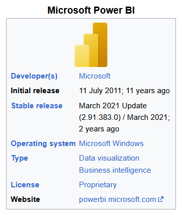
A Scorecard, sometimes referred to as a vertical table, is where data is displayed in a two-column table, with the first column displaying an attribute and the second column displaying the value for that attribute. Often, these scorecards are focused around a singular key, such as a Project or a Company. For example, take a look at this sidebar on the Microsoft Power BI's Wikipedia page:
Creating a Scorecard in Power BI
Unfortunately there is no 'Scorecard' visualization option in Power BI. And while you can create a similar looking table effect manually, by using dozens of individual text boxes and KPI objects, that approach is complicated, time consuming, and a headache to maintain.
Thankfully, there are a few different methods that you can use to create a true a vertical table—so let's walk through how we do it.
Migrating from Qlik or Tableau to Power BI / Fabric?
Don’t start from scratch. Vortex automates up to 70% of the work—cutting costs, time, and risk.
See how Vortex can simplify your migration →
Step-by-Step guide
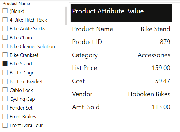
Let's imagine you're a Sales Manager and want an app to track the various products that we sell. On a single sheet, we want to be able to select a single product and be presented information about that product in the form of a scorecard.
At a basic level, the end result should look like this:
Create the island table
First, create an island table (a table that has no relationship to any other tables) in your data model. It should contain two Columns: Parameter Names and an Index.
An index is strongly recommended, especially in cases where you want parameters to display in an order that is NOT alphabetical (the default, which cannot be without an index column).
Enter the parameters in the order that you want them to display in the visual, and then add an index column (Transform > Add Index Column). This will make sure the parameters always show in the intended order on the visualization.
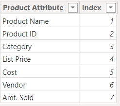
The attribute column's data type should be set to text; this is the column that will display on the left side of the scorecard. Double-check that this island table has no relationship with other tables in the data model; it needs to be an island!
Scorecard Measures
Next we need to create all the measures we intend to use to calculate the Value column in our scorecard. You should have one measure for each row in the final table; these will eventually make up the right hand side of the final scorecard.
Most of the example measures are relatively simple and retrieve a value from a column in one of the model's tables based upon a user input (through the Product Name page slicer, referenced earlier):
Product Name = COALESCE(SELECTEDVALUE('Product'[Product Name]), "Please select a single Product")
Product ID = COALESCE(SELECTEDVALUE('Product'[ProductID]), "N/A")
Using the DAX function COALESCE is important because it allows you to set a default condition if a user selection is not made (nothing selected in the Product Name slicer), or if there is no value that can be returned.
This strategy helps to control the final formatting and feel of the vertical table.
You can also create more advanced calculations that will only return a value if a single Product is selected. For example, this is our measure definition for the YTD Amount Sold calculation:
Product Sales YTD =
IF(ISBLANK(SELECTEDVALUE('Product'[Product Name])),
 "N/A",
 TOTALYTD(
    SUM(Sales[OrderQty]),
   Sales[OrderDate]
))
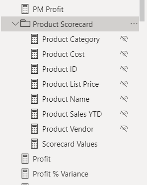
Once we've created all our measures, it's a good idea to organize them in display folder for easy access and maintenance. (You may also want to hide these functions from users, as they are meant to work specifically in our scorecard and may not calculate properly in other locations.)
Now create a Table Visual using the Parameter Column from the Island Table as one of the column fields, and sort that column using the Index that you created.
Switch Statement
Next, we have to match each parameter's name (text) to its value, using a SWITCH statement measure. The switch statement in our example looks like this:
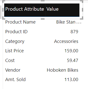
Scorecard Values =

//This measure is used to pull the correct info fields to display in the Scorecard visual.
Scorecard visual is used to view info for one project. The filter context (project name) is passed to this measure.

   SWITCH(

   SELECTEDVALUE('Island Table'[Product Attribute]),

    "Product Name",     [Product Name],

    "Product ID",       [Product ID],

    "Category",         [Product Category],

    "List Price",       [Product List Price],

    "Cost",             [Product Cost],

    "Vendor",           [Product Vendor],

    "Amt. Sold",        [Product Sales YTD]

    )
This measure is used as the second column in the Scorecard visual (Table Visual); It looks up and reports the correct measure value based on the Product Attribute. The SWITCH statement acts like an "instructional guide"; as it tells the engine "when you see A, report B" and "when you encounter C, report D."
At a surface-level view, it may seem like the SWITCH statement is going in order of its inputs, but it's really comparing each value from every row in the ScorecardInfo column (the Island Table field being used as the TEXT column in the Vertical Table visual) against its list of predefined values and looks for a match. If it finds an exact match, it outputs the second argument in the same line (i.e. When "Cost" is found, the value from [Product Cost] measure is displayed).
Once you've added this measure to the Scorecard, it's time to do some formatting and display options.
Formatting and Controlling Sorting
At this point, you should have a fully functioning scorecard. But because this uses a regular table object to display information, the table will still allow users to change the table sorting (ascending/descending). You may want to disable this feature, because it impacts the final layout of the visual.
While there is no way to disable the sorting feature on a table visual, there is a workaround: place an invisible, “unselectable” button on top of the table visual. You place the button on "top" by ensuring the button sits above the table visual in PBI's Selection Pane. This blocks the users from being able to click on the column table's headers and prevents the sorting action.
1. Add a Blank button to the report page (Insert > Button > Blank) and size it so that it is as big as the visual or area you want to obscure). Make sure to clear all styling from the button, including any border that might appear by default.
2. Create a blank bookmark in the Bookmarks Pane (NOTE: Make sure NO visuals from the report page are selected when you do this step), ours is labeled "No Click." Then click the bookmark's ellipsis and UNSELECT: Data, Display, Current Page & SELECT: Selected Visuals (this makes sure the bookmark will only be applied to visuals that you choose instead of applying to all visuals on the current page).
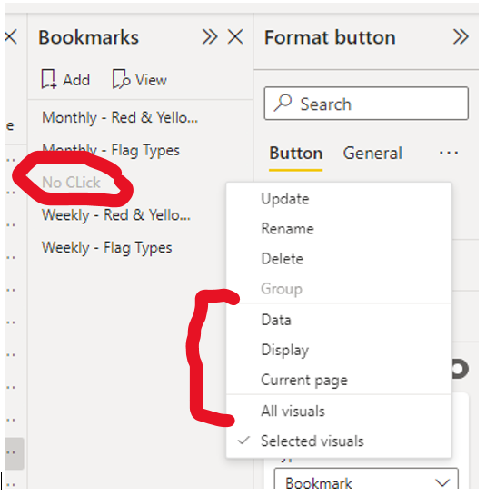
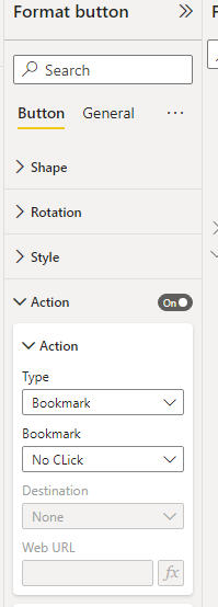
3. Next, go to the invisible, blank button you created. Configure the action to Bookmark and choose the No Action bookmark you created:
4. The final step is to adjust your layer order on your visual so that the button is above the table visual, but below anything else that users need to interact with. This is set in the Selection Pane, which you can find by going to the View tab. The Selection Pane is used to hide or show visuals and to set layer order of objects (above / below).
- Place the scorecard on the “bottom”
- Put the no click button on top of the vertical table in the selection pane. On the report page, arrange the button so that it just covers the vertical table's column headers.
- Group the button and vertical table in the selection pane, so they don’t get moved accidentally during further maintenance or development work.
- Placed any other items as necessary
Review
While there is no simple way to create scorecards in Power BI (yet), with some careful maneuvering you can create a table that looks and acts like a traditional scorecard. The approach laid out here is flexible and user friendly in terms of maintenance and future change requests; once in place, it's extremely easy to update the table to feature more or fewer fields.