
Recently, Axis Group’s Director of Visual Analytics, Speros Kokenes, appeared on The Analytics Buzz, a podcast from the Business Analytics Center at Georgia Tech, to discuss data visualization, including its current state as well as future trends.

Data visualization is the process of taking data and turning it into graphical representations that reveal patterns and insights. Graphical representation of data takes advantage of the human brain’s natural visual processing ability to analyze and understand data more effectively. Structuring data into visualizations rather than large tables of dimensions and facts allows us to more easily recognize patterns and discover insights. Take the table vs scatter plot example below:
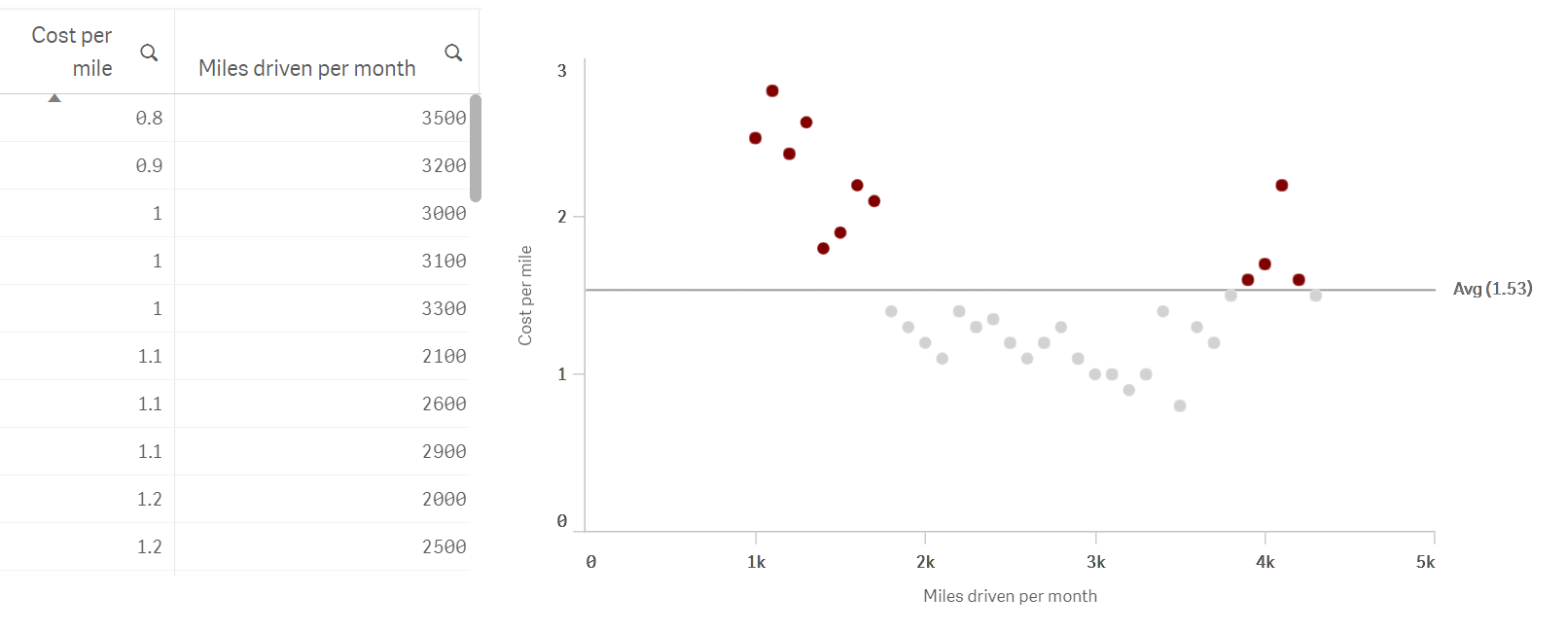
In the scatter plot above, we can instantly see both clusters and outliers; in the table these patterns are far less obvious and would likely take many minutes of sorting and re-sorting the table to identify.
Data visualization is starting to become more popular and organizations are beginning to put a great emphasis on the subject. Even just a few years ago, it was necessary to pitch how and why data can help a business; now, that is common knowledge, and how to more quickly and easily manage and view that data is the new pitch. Organizations are realizing that the skills to create and, more importantly, use visualizations to discover insights in their data are not just a side responsibility. These skills are crucial to the modern data analyst, and they will become more and more important as we move into the future.
There are four main changes and trends in the practice that Speros touches on:
First, data visualization is becoming much more interactive and is no longer a static process of producing a chart, putting it in a report, and giving it out to someone via email or a shared drive. Tools available in the market today enable business users to interact with their data themselves, manipulate it on the fly, and discover insights hidden in their big data sets.
Second, the user group who consumes these visualization tools is expanding to go beyond management and analysts to reach the operational level. For example, a salesperson, when given access to a data visualization tool, can answer his or her customers’ questions on the fly.
Third, changes in technology are allowing users to view the massive quantities of big data our world produces and are enabling users to create interactive data visualizations using less code.
The last trend Speros discusses is the rapid change of design and visualization tools to become more aesthetically pleasing, encouraging more people to consume data visualizations more often. Humans are collecting data at record pace, with 90% of the entire world’s data having been collected in the last 2 years. Tools to sift through this data and get true value out of it must evolve to be better, faster, and more efficient.
To hear Speros Kokenes expand on the current state and trends in data visualization, check out the full podcast here.
The Analytics Buzz is a podcast about trends, tools, techniques, and talent related to data science and analytics.