Axis redesigned Power BI reports to meet users where they and enable them to answer the questions they really need to know. The new applications streamline information and analysis paths, making the Power BI experience much more natural for the company's users—for both desktop and mobile, all while maintaining their brand identity.
Gen Ellsworth, Axis Group
Our client is a major cold storage warehouse and transportation company with thousands of employees and operations on three continents. They focus on connecting food producers to distributors, retailers, and consumers, and provide warehousing services such as blast freezing, picking & packing, and food processing.
While the company used Microsoft Power BI to assess Orders, Finances, and Operations, their existing reports did not use UX design effectively to meet end user expectations. Axis’s team of designers and specialists redesigned its dashboards and mobile experience to optimize analytics for several groups, including Business Development personnel, FP&A and Site Managers.
With Axis’s redesign, the organization's Power BI applications now effective answer users’ questions, enabling better analytics and also incorporating the company’s brand identity into the design language. We streamlined analyses to mirror the drill down behaviors users expect, creating a natural and effective workflow, while clearly delineating the different use cases for each application—on both desktop and mobile.
Problem 1: The company's existing Power BI applications did not consider User Experience
When we began our work, the company relied on two distinct applications—one themed around operations and the other around financials.
The first was the Orders & Receipts (O&R) dashboard—an operational view showing key metrics and KPIs for an up-to-date view of a site’s performance that was used often by Site Managers and Business Development users. The second was the Financial Planning & Analysis (FP&A) dashboard—a mashup of various views including corporate finances, site finances, customer operations, and customer finances. This dashboard was utilized by all the aforementioned users, with distinct views segmented across different sheets in the application.
While the dashboards provided access to requested information, they were not designed with users in mind, leading to inefficient workflows, redundant information, and a lack of understanding of how to move from data to insight to action.
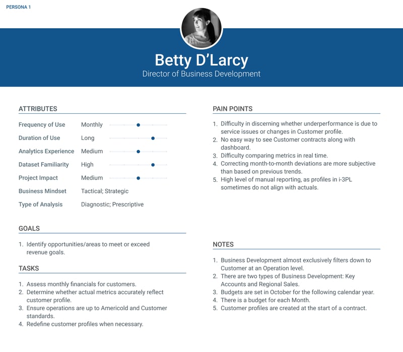
The Axis team conducted deep research to understand the business model and operations to develop hypothetical personas, creating a basis on which to conduct our user interviews. Over several weeks, we refined our models, aligning the various needs and requests of members in each team. We used the new understanding to drive creation of foundational artifacts including corrected Persona Cards, a Business Process Map, and two Task Analyses—one for Business Development and one for Finance.
At the start of the project, both Axis and the company's stakeholders anticipated a new design that would unify all analyses into a single report. While some headway was made in combining the BD and Financial applications, it soon became apparent that drill-downs followed different hierarchies, and a unified application would require users to constantly adjust filters (slowing down their analytics process), or review duplicative information in various areas of the dashboard (potentially leading to confusion or misremembering where metrics were located).
With deeper UX research and a detailed Task Analysis, we came to the conclusion that the best way to minimize redundancy and let users answer their questions actually was to design two separate applications—but to remix the users along different entry points than anyone expected: one focused on business development and customers, and the other focused on financials and planning.
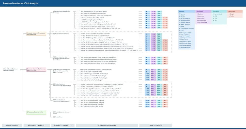
With the new approach, the Business Development team and Financial and Operations teams could function separately for most areas, but still access the other team’s dashboard to answer one-off questions outside their own sphere. With prototyping and testing, we designed user paths where the Business Development team could drill through their customers down into specific site contracts, and the Finance team could easily drill through regions to specific sites and then customers to answer operational questions.
Problem 2: The existing Order Tracker did not meet user needs on desktop or mobile, and didn’t match the company’s visual style
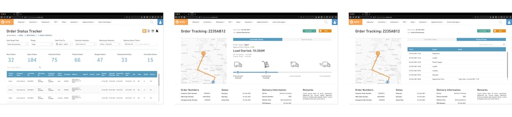
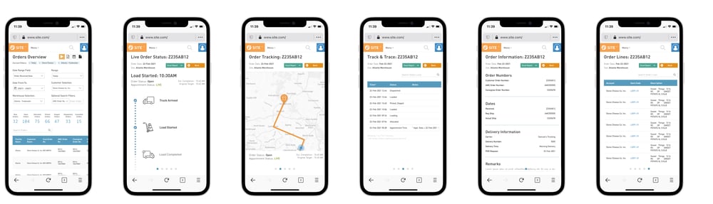
The second part of the project was to redesign the organization's existing Order Tracker, which lets external customers or internal users search, find, filter, and access specific orders by customer, site or region. When it was first built, the tracker did not deeply consider how people would actually use it. Over time, dashboard users found it difficult to navigate and use—particularly on mobile, where people have come to expect easy access to answer their questions.
To streamline the Order Tracker use case, the Axis team drew on the design language from the new Power BI reports. Importantly, Axis did not need to add or remove metrics or filters, but we were still able to create a mobile experience that met users’ needs.
Over several days, the Axis design team iterated ways to most effectively lay out views that would be effective on the mobile web. The final prototypes showcases an Order Tracker that logically flowed from searching, to refining results, to inspecting specific orders and ultimately down to line items.