
In a large business, overutilization of supplies and expenses can amount quickly if you are not careful. One of the most difficult things for a business is to be able to determine exactly how much of a specific supply is being used at any given time. The inconsistency of supply cost is especially apparent within a hospital, where supply cost is only captured from procurement, and does not correlate with the actual usage within patient care. Determining the cost and usage of supplies within the hospital is becoming increasingly necessary, and that is where Axis can help.
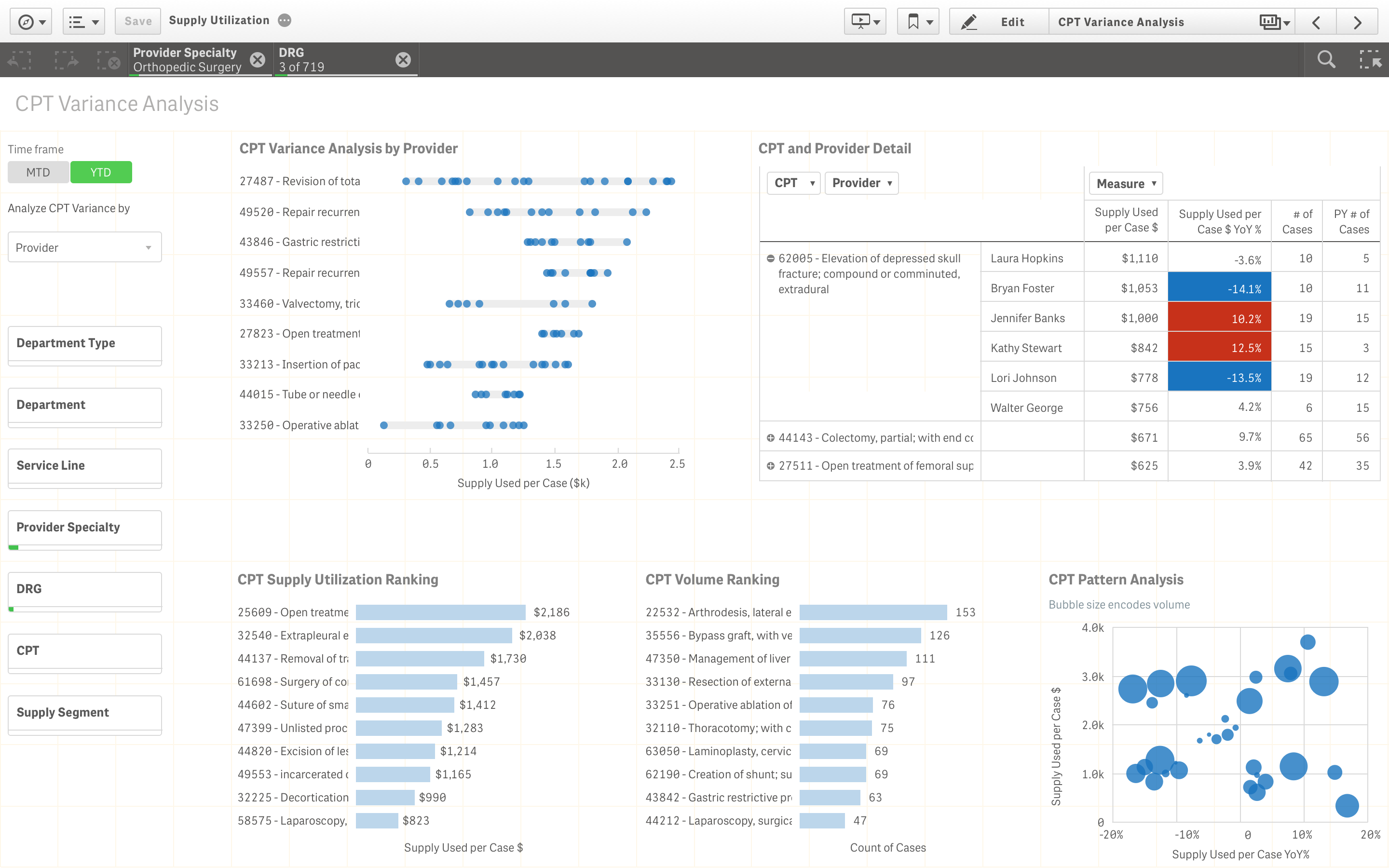
In this dashboard, a CPT represents a specific procedure which is being performed on a patient. On the left side of the dashboard resides the various filter panes which may be applied to the charts to better narrow down the data being displayed. These filters can be used to do various transformations, such as changing the way the data is analyzed between Provider, Facility, and DRG (Diagnosis Related Group), analyze the information by Month or Year, or compare the data by department.
Various charts are used within the dashboard to display different information relating to the supply usage, volume, and YoY (Year over Year) change. In the dashboard, we see a pivot table which is used to represent CPT and provider detail. Blue and red are used to represent change from last year in usage, of over and under 10% respectively. The distribution plot shows you the varying CPT Provider supply usage, sorted by each CPT. The dashboard also contains two bar charts, which show the rankings among the CPTs for supply utilization and volume, respectively. Finally, there is a scatterplot which allows you to better visualize CPT Patterns for analysis and includes the volume as the bubble size.
Summarized Points:
- The dashboard uses 5 charts and various filters to help the user understand and visualize the information.
- There are many different relationships between the data in each chart, all of which connect well with one another.
- Color and size are used to represent noteworthy change in the data.
The Contributors:

Gen is our in-house pixel-perfect precision master. While enjoying strategic and analytical thinking, he also pays attention to every detail. He is a UX Designer at Axis Group who received his Masters Degree in Industrial Design from the Georgia Institute of Technology.

Jacob Stanilious graduated from Rutgers with a degree in Information Technology and Informatics and a minor in Economics. His hobbies include playing video games as well as outdoor activities like ultimate frisbee.