
Recently, Manasvi Lalwani showed us what a Target Plot is and how it might be useful. I decided to put it into practice in Qlik Sense and see what I could discover about the energy consumption and greenhouse gas emissions of buildings in Boston, Massachusetts. This data was part of the 2018 Qonnections Qlik Hack Challenge, and still offers an excellent means of experimenting with different visualizations while possibly making a difference.
Feel free to download the QVF file with the target plot I created for this blog post. I also recommend that you download and experiment with Vizlib’s Qlik Sense extensions.
First Look
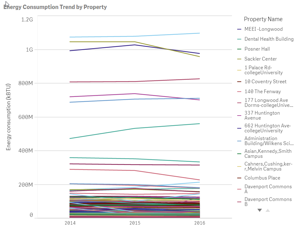
The goal of this analytical exercise is to organize buildings into different groups based on their energy consumption trend over a three-year period. My first impulse would be a use a line chart, but as the example below demonstrates, these charts do not allow us to discern, nor filter, individual buildings with a common behavior. In other words, I can’t easily select lines that have a similar slope.
Another Angle
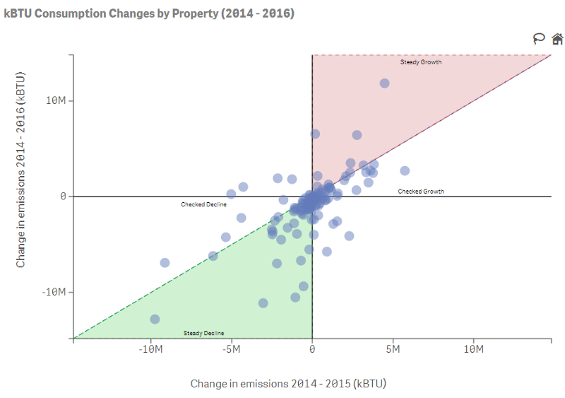
The target plot introduces a simple method for grouping lines by their trend. Starting with a scatter plot object, it’s easy to calculate the x-axis and y-axis with set analysis. For example, I used the following formula to calculate the x-axis of the target plot.
sum({$<BERDOYear={2015}>} [Total Site Energy (kBTU)]) -sum({$<BERDOYear={2014}>} [Total Site Energy (kBTU)])
The challenge in Qlik is to visually group the dots. If we use a native Qlik Sense scatter plot, we can make the quadrants stand out by hiding the arbitrary grid lines and adding a x- and y-axis reference line at 0. We cannot yet create 45-degree reference lines, but we can color the dots to distinguish the groups within the quadrant.
While this is workable, there is a better solution that will allow us to add another layer to organize the dots and keep the use dot color available for a deeper analysis.
Adding an Additional Layer
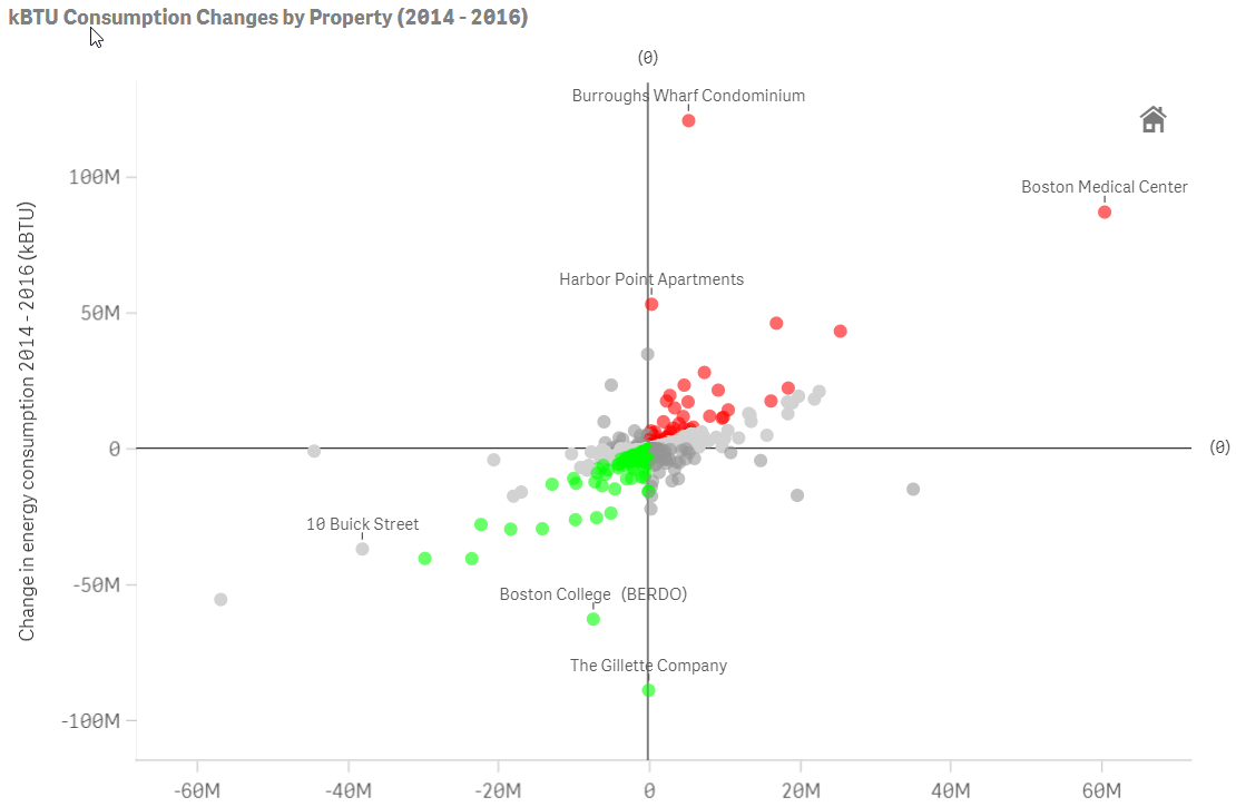
If we use Vizlib’s scatter plot then we can group dots by coloring the area underneath them. In Vizlib, an area can take any shape. We can even use a polygon area to create a 45-degree line. Also, this Qlik Sense extension has so many properties that there are plenty of ways to create workarounds. For example, I created area labels using an invisible reference bubble with a visible label.

We can then use dot color to organize the points by a different dimension and look for patterns based on this additional variable.
Chart Symbiosis
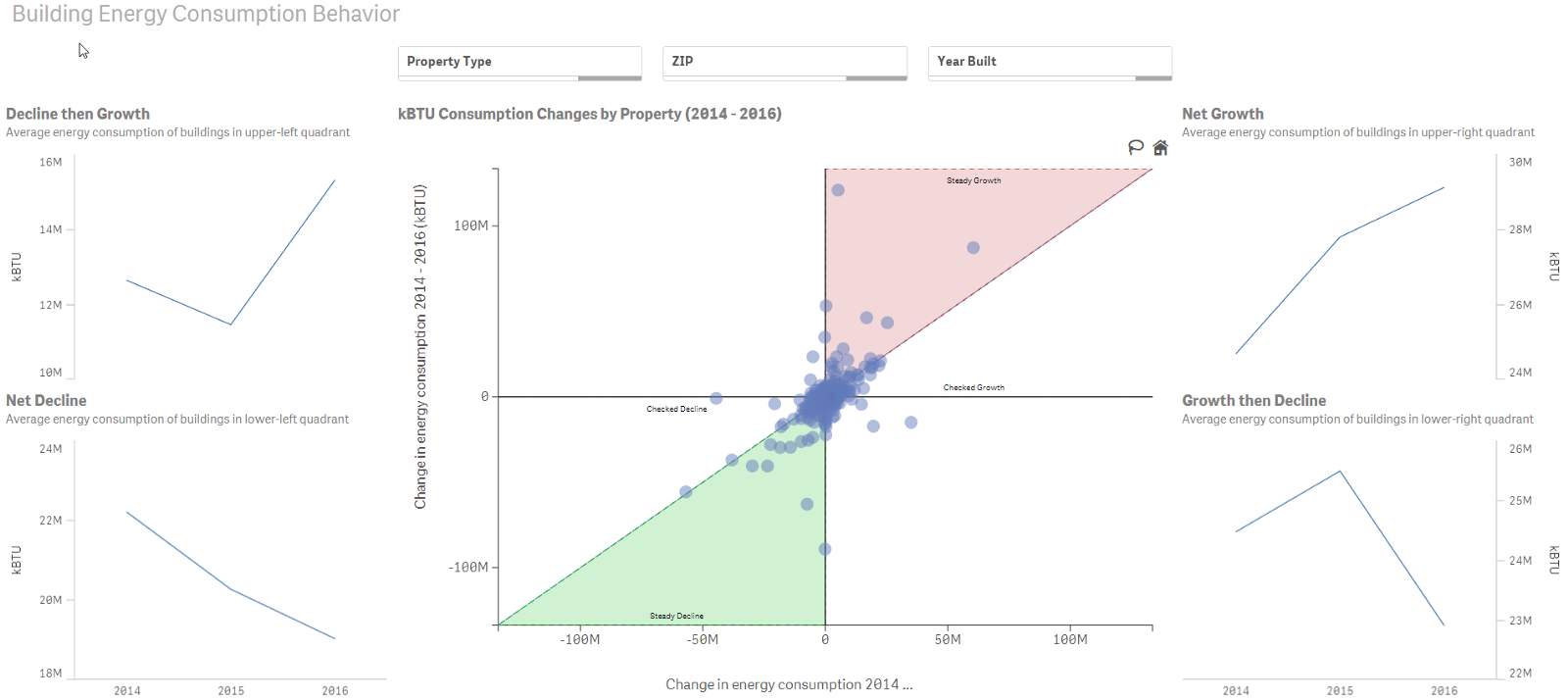
A simple scatter plot can confuse users. A target plot adds a greater burden to remember the specific meaning of each quadrant. Along with text labels, we can also use other charts to both support the main chart while at the same time add additional insight. In this case, we add summarized line charts to remind us what type of trend each quadrant represents, and concurrently, they make us aware of the real average rate of change.
Takeaway
Based on this analysis, we can easily determine which buildings have experienced either a steady increase or decrease in energy consumption. This behavior may be a useful filter that we can use to study a building’s energy consumption in more detail.
In our own day-to-day analysis, I would recommend experimenting with target plots if you use slope charts like the one below. Over a three-year period, it is an excellent method to group lines by their slop. For example, they can detect customers, products, sales reps, etc. that are steadily rising or falling in the ranks.
“About Slopegraphs and Bumps Charts” by Julian Villafuerte
Feel free to download the QVF file with the target plot I created for this blog post. I also recommend that you download and experiment with Vizlib’s Qlik Sense extensions.
The Contributors:
 Karl Pover is a Solutions Architect at Axis Group. Over the course of the 13 years he’s worked with Qlik software, he’s shared his experience as the author of 2 books (Learning QlikView Data Visualization and Mastering QlikView Data Visualization) and his Harvesting Wisdom blog. He’s been a Qlik Luminary since 2014 and you can follow him on twitter at @karlpover.