
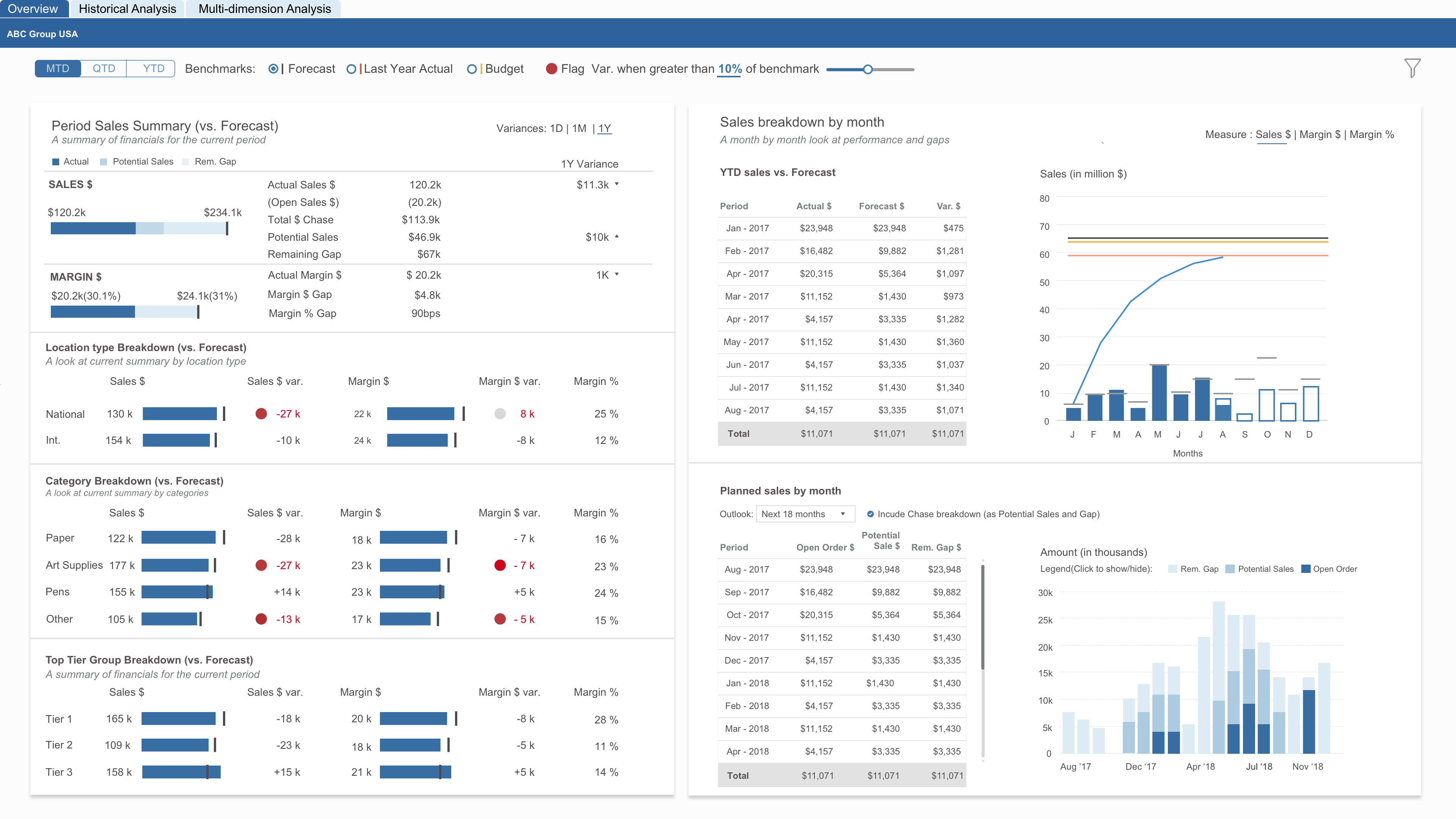
How are your salespeople performing? At any given time, answering this question can be difficult. Some sales are complete but others are still being closed. Even if you know the progress of all ongoing sales, you might not be on pace to meet your targets. Tracking these questions across all product categories, locations, and product tiers could take a lot of time. Axis Group’s Period Sales Summary Dashboard lets you see this information at a quick glance, while also providing context in the form of monthly goals. As sales succeed or fail over time, the dashboard gives insight into whether sales are on pace to meet the Chase target.
How Axis Group Helped
The Period Sales Summary Dashboard presents users with a large breadth of detail without ever feeling cluttered. Minimal and consistent colors are used. Completed Sales orders are represented throughout by dark blue. Potential sales are visualized by a lighter shade of blue, and the remaining gap is a light sky blue. High variance against the projected benchmarks stands out via red numbers and a red flag icon. Horizontal bar charts are used across each dimension to represent sales volumes. The right half of the dashboard is dedicated to looking at sales by month. A combo chart plots cumulative annual sales against monthly figures, and a stacked bar visually displays when sales of different types occurred.
Summarized Points:
- Consistent color scheme across all visualizations – the same color indicates the same thing
- The color red has a negative connotation: variance is more than 10% of the benchmark
- Good use of combo chart and stacked bar chart to display sales volumes over time.
The Contributors:
 Manasvi has a Master’s degree in Human-Computer Interaction from Georgia Tech with a background in Interactive Computing. Manasvi's design philosophy is rooted in research and rapid prototyping. “Fail early and fail often” is her motto. Manasvi enjoys discovering and sharing new articles and podcasts on design, as well cute animal GIFs for when you need a pick-me-up.
 Philip Rembert is an Industrial Engineer from Georgia Tech. He began his career in a rotational program working in Atlanta. After learning several positions, he discovered Business Intelligence and has happily stuck with it since. He enjoys helping others solve problems and discovering the stories behind data. When he isn’t working with data, he is an avid board game and card game player.